When you are using NZB Completion Checker, you have the opportunity to join the community effort (as mentioned in a previous post), were you make your completion results available for others users (anonymously). With 10.000 entries in the database as of now, I have the chance to display some statistics for you.
Just keep in mind, that the statistics are not totally fair, as each file has NOT been tested against every server in the list. There are over 100 different servernames logged in the database. Some are for SSL hosts, while others might be to the same host – just without the SSL part.
I have in NO way changed any of the data, nor have I tried to filter duplicate servers. This is a raw dump from the database with some grouping/sort and other functions.
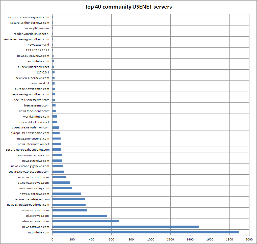
Lets start with the first statistic (click to enlarge image – opens in new window!)

This image shows the top 40 most used servers – checked with NZBcc. From top 40+ and up, the numbers even out so I choose to ignore them. Now this might not show the true image of the most popular USENET server in the world – it just shows which usenet server was most popular in the community effort.

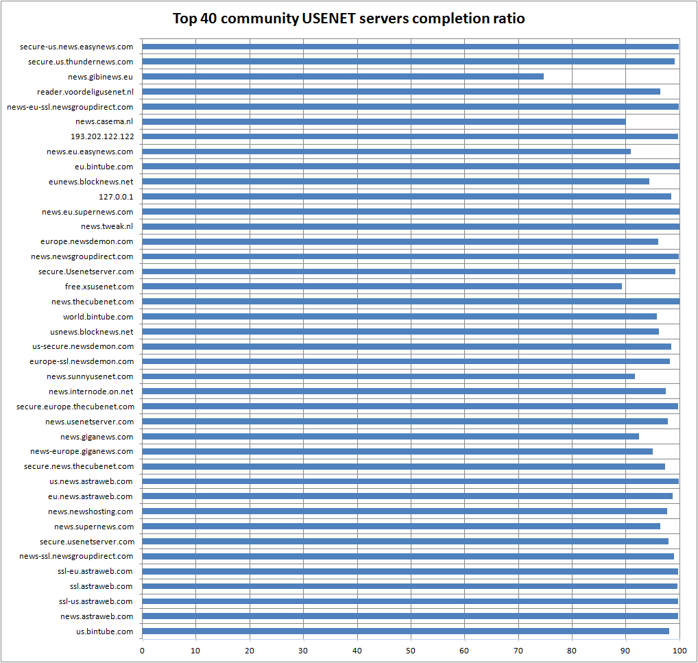
This images shows the same servers as before except is shows the completion ratio of all the files that were tested against each server. As before, this statistics does not show in general how the completion ratio is on every server listed. It could be, that a lot of old files were tested against these servers, giving the impression that they have low file retention. That data is not available to me.
If any usenet oriented site would like to get hold of the raw data to make their own statistics, drop me a line 🙂